


Ddyracer
-
Posts
268 -
Joined
-
Last visited
-
Days Won
2
Content Type
Blogs
Gallery
Downloads
Events
Profiles
Forums
Articles
Media Demo
Posts posted by Ddyracer
-
-
This version opens not web browser, but 'App Store' application. So you can reduce one step to buy application. :-)
I think i'm an idiot, the DS workflow actually checks the iOS app store not the MAS. What a fool

-
I already knew about that the extension by Daniel Shannon. It is a great extension, too.
My version could be just another version. It is the simpler code than Daniel's, and displays rating and moves to Mac AppStore directly.
Good point, I did miss the ratings feature. What exactly do you mean "move to mac app store directly"?
-
You may not know about this: iTunes Store Workflow. It has the Mac App Store as well. It's by Daniel Shannon.
-
I did too. And narrowed the window, shrunk the text, and made the shortcuts visible again. And set the blur hack to maximum.
Looks great! Thanks, Ddyracer.

Your welcome! I never use those shortcuts myself so i didn't put them in. Btw, lots of themers here like borderless windows why is that? I like the border and think it looks too bare and it's hard to see where the window ends without it but that's just me.
-
David' Ferguson's Weather workflow could be edited to do this; the Weather Underground API is very flexible and easy to use
I'm a noob at such things

-
So, has anyone made or heard of one? Really would love to see the forecast by hour so i don't have to Google it.
-
I loved it! (I eliminated the border completly and it looks waaaay better!
Thanks! I like some border so it doesn't look too bare but i totally see why some might hate it.
-
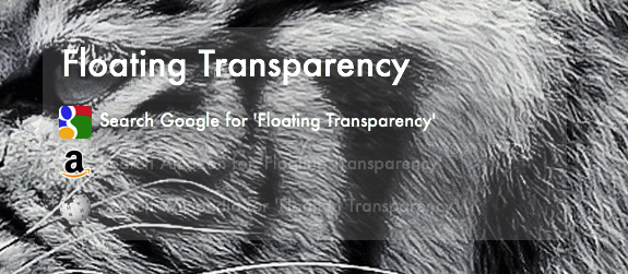
So I made a transparent theme, which you probably should use with a completely black wallpaper or completely white for the best effect and/or use the blur hack. Click here for the link. Please let me know what you think

Here's what it looks like:
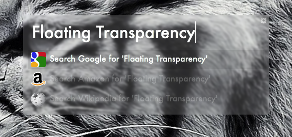
So, i thought the theme could use some subtle changes so here you go:
Before Blur
After
-
This hack is so cool, turned mine off for now though. Thanks Andrew!
-
ok, I hope you like this theme. I think is one of those theme that can be called System Sweet or Sweet Alfred... My Wife loved it. Enjoy.
Download here: http://bit.ly/106phqA
DL link is broken
-
Mint theme
in Themes
So, I thought why not change my current turquoise theme to something that reminds me of mint which I love.
And here it is...

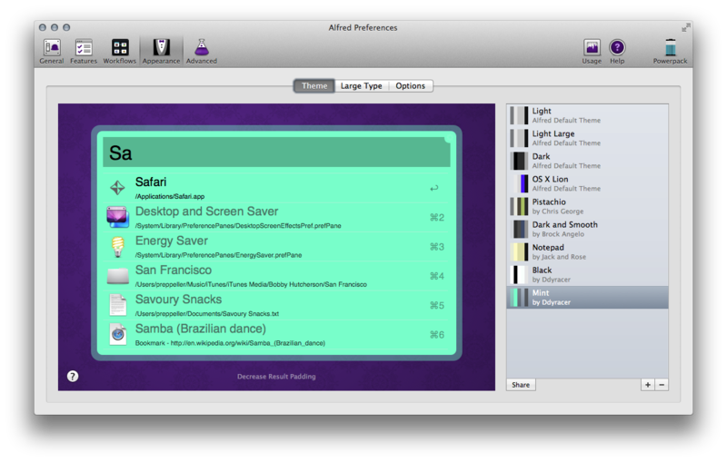
Please let me know whether you like it or not and give me some pointers (if you think it sucks) on what to improve. I guess i'll give the theme file if you guys think it's worthy enough


Floating Transparency
in Themes
Posted
So you like minimalism. Ok, but for a transparent theme I dunno, you can barely see it and knowing where the window ends kinda helps clicking the hit target when your moving the alfred window. That's my defense lol.